Something is off. You know it. You have rearranged it twice, repainted it once, added the rug everyone recommended, and the room still feels slightly resistant. Often the issue is not taste. It is that most people were never taught two things: the measurable conditions that make a room settle, and the fact that a century of rational decisions slowly removed those conditions from everyday residential building. You cannot fix what you cannot diagnose. And you cannot fully diagnose it without knowing how it broke.
What follows is not a style guide. It is a history and a diagnostic in one. Each condition has a number worth checking, but behind each number is a default set somewhere between 1920 and the modern construction boom: by ideology, by supply chain, by speed, by cost, by what photographs as “clean.” Understanding the default is what makes the correction feel permanent rather than provisional.
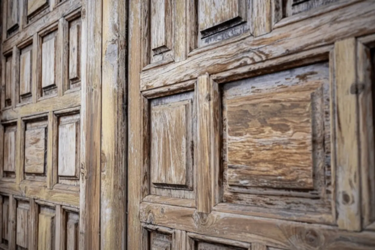
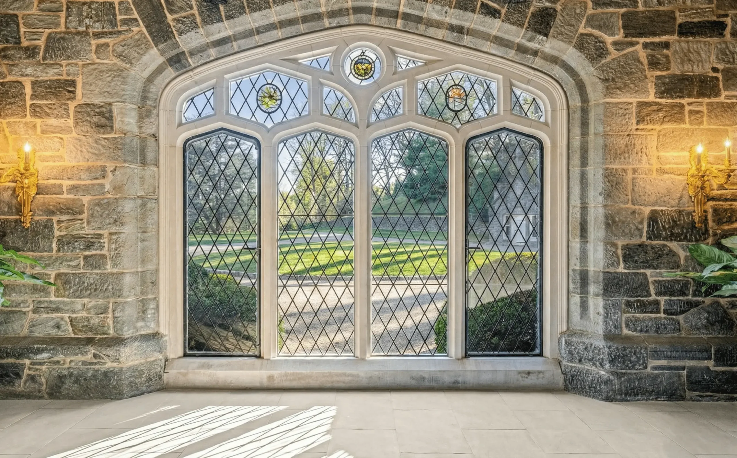
Pre-war domestic interiors were not warm by accident. They were warm because the materials and methods available to builders produced, by default, the conditions many people respond to: mass, shadow, enclosure, and surfaces that do not behave like a showroom. Thick plaster moderated temperature swings and softened sound. Deep window reveals produced shadow. Timber conducted heat slowly underfoot. Fireplaces created low, directional light. The room’s warmth was a byproduct of construction. Comfort followed.
What happened between 1920 and the Bay Area spec era was not one villain. It was five shifts made for legitimate reasons, each carrying a hidden cost that becomes obvious once you know what a room needs to feel inhabited.
Glass, Steel, and the War on the Wall
Modernism argued against the decorated interior. Ornament was framed as dishonest. The new architecture would be open, spare, and structurally explicit: glass, open plans, flat roofs, industrial materials used without apology. It produced buildings of extraordinary rigor. It also, as a commitment, reduced several domestic comfort cues at once: enclosure, depth, shadow, and material softness.
The Drywall Revolution
Post-war housing demand favored systems that could be installed quickly and consistently. Drywall replaced multi-coat plaster because it was fast and required less specialized labor. The shift was practical. The side effect is familiar: thinner walls with less mass, rooms that feel acoustically harder, and interiors that swing more noticeably between “too live” and “too flat.”
The Wall That Disappeared
Open plan moved from a design idea to a default. Rooms merged into one volume that photographs well and sells easily. The practical result is often a space with fewer thresholds, less acoustic separation, and fewer “edges” the body reads as rest. The room can feel like a passage rather than a destination.
Expensive Rooms, Comfort-Hostile Specs
The Bay Area boom years produced a recognizable recipe: large open volumes, hard finishes, and “clean” builder whites. Each choice is defensible in isolation. Together, they can create rooms that look impeccable and feel unsettled. Polished concrete floors, for example, are durable and elegant, but their thermal conductivity (around 1.7 W/mK) can read as cold at foot contact regardless of thermostat settings. High ceilings and open plans can flatten proportion. Hard surfaces can make the room acoustically live. And high-LRV whites can erase shadow and depth.
The Bulb That Shifted the Room
LED adoption was environmentally correct. The domestic issue was one quiet default: many readily available LED options skewed cooler, because “bright per watt” sells and commercial supply chains standardize. In a home, a cool Kelvin value can drain timber of amber depth and make textiles read flatter. The room is not colder in temperature. The rendering is colder.
The result is familiar: open plan, hard finishes, high ceilings, cool lighting, bright walls, and rooms that photograph well but feel persistently unfinished in the body. The conditions that produce recognition, described in The Architecture of Nostalgia, are not absent because the owner lacks taste. They are absent because defaults, stacked over time, removed them.
The Architecture of Nostalgia
This article is the diagnostic: what tends to go wrong, measured. The Architecture of Nostalgia is the destination: what rooms feel like when those conditions are corrected, and why that feeling matters.
These are five conditions worth checking before you change furniture or buy new “style.” Each has a number you can verify, a common origin, and a correction you can make without demolition. Think of them as diagnostic defaults: start here, then refine.
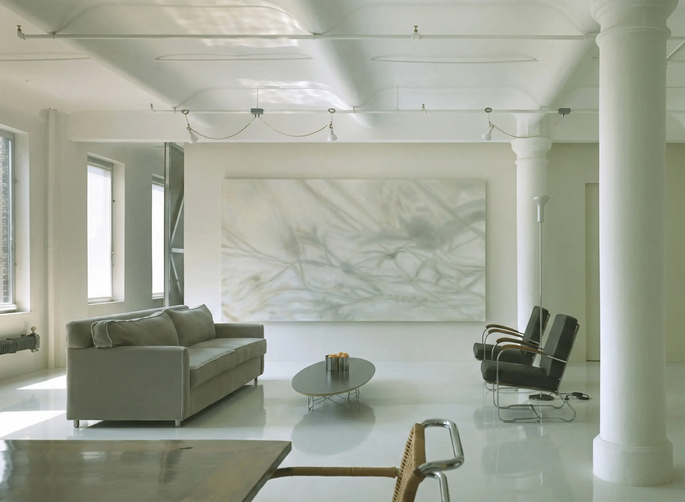
LRV is Light Reflectance Value: a 0–100 measure of how much light a paint reflects. When LRV is very high, walls can bounce light so aggressively that shadow reduces, corners soften, and the room loses dimensional cues. The eye reads less depth. The room can feel “clean” and still feel wrong.
If your walls are in the high-80s and 90s, you are not imagining the flatness. You are seeing a room with fewer shadows than the architecture can support.
Start by testing LRV 55–72. In many Bay Area rooms with cool daylight, this range restores depth without making the room feel dark. Check the number first, then choose the color.
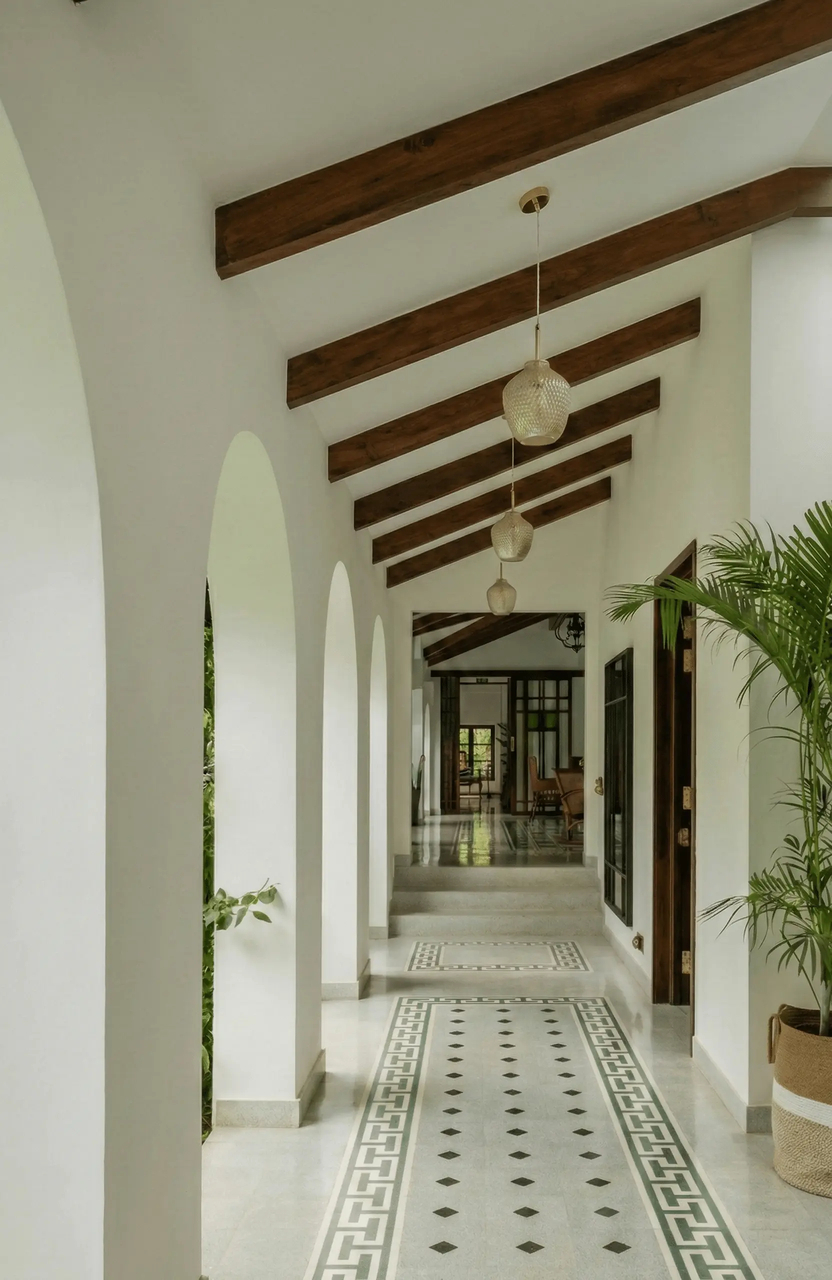
Proportion is not taste. It is scale. Many people feel best in rooms where height and width hold a readable relationship and the space offers enclosure without compression. A practical heuristic: about one foot of ceiling height for every three feet of room width.
Open-plan volumes often drift outside this range. The result can feel impressive and still feel uninhabited. The fix is not “better furniture.” The fix is giving the eye boundaries and the body places to rest.
Without renovation, you can still reintroduce boundaries: a horizontal picture rail, a deep cornice, or wallcovering that stops around two-thirds height to reassert where the room ends. A large-format wool rug establishes the floor plane and makes height feel more proportionate. Curtains hung at ceiling height create vertical edges where open plans often lack them.
Kelvin is color temperature. Lower Kelvin values read warmer. Higher Kelvin values read cooler and more clinical. The Kelvin number does not just change “mood.” It changes how timber, textiles, and paint actually render.
In most living spaces, 2700K is the clean correction. Timber deepens. Whites stop reading as blue. Textiles regain texture. If you need sharper task light, use 3000K in limited zones, not everywhere.
Replace bulbs in the room with 2700K equivalents. Avoid “cool white” or “daylight” for living spaces. Then reduce reliance on overhead light and introduce lower, directional sources at seating height to rebuild depth after dark.
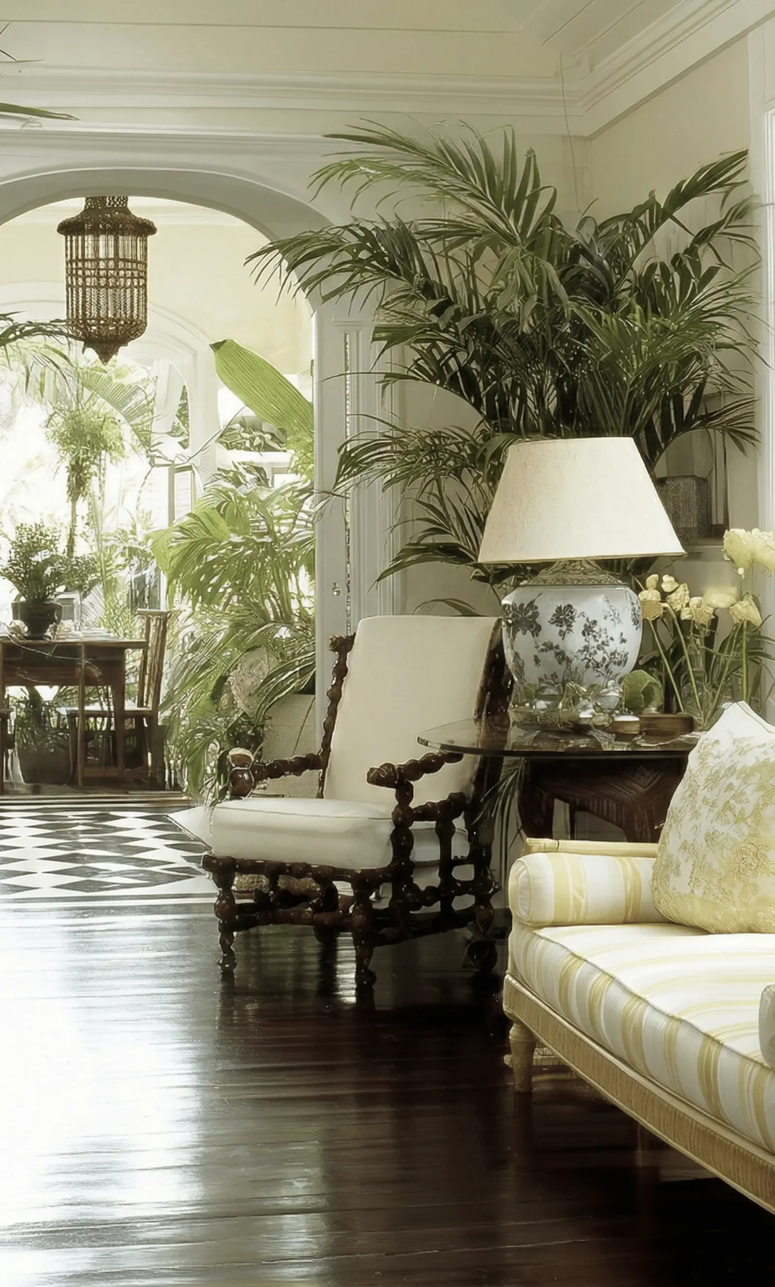
Hard, parallel surfaces can create a “live” room: reflections that do not read as obvious echo, but still register as agitation. Concrete, drywall, glass, and metal together can make a room feel louder than it is.
The practical goal is not silence. It is absorption: enough textile and softness to take the edge off reflections so the room feels settled.
This is why a single large textile can feel like a switch being flipped. The change is not visual alone. It is acoustic.
Add absorption on more than one plane. A genuinely weighty wool rug is usually the highest-impact first move. Floor-to-ceiling curtains come next. A handwoven tapestry on a primary wall is another. Together, these can materially reduce reverberation without structural change.
Thermal conductivity describes how quickly a material pulls heat away at the point of contact. Concrete conducts heat far faster than wool. That is why concrete can feel cold even when the room is warm. The sensation is real. The thermostat is not the whole story.
The fix is also physical: change what the body touches.
Cover cold floors with low-conductivity material. A properly sized wool rug changes foot contact everywhere it lands. This is not a styling trick. It is physics doing its job.
-
LRV of your paint If the walls are very high LRV, shadow reduces and rooms can feel visually flat. Test LRV 55–72 before you overhaul furniture.
-
Ceiling-to-width relationship Measure your room. If the volume feels exposed or compressed, add boundaries visually: rails, cornice, curtains, and a large rug to reassert the floor plane.
-
Kelvin temperature of your bulbs In living spaces, start at 2700K. Keep cooler temperatures to limited task zones if you truly need them.
-
Hard surface dominance If most surfaces are hard and parallel, add absorption across multiple planes: rug, curtains, upholstery, tapestry.
-
Floor material at contact If the floor is stone, tile, or concrete, it will often read cold at the foot. Cover what the body touches.
A room that feels wrong is not a failed room. It is usually a room that inherited defaults made for speed, efficiency, or a photograph. Most of what you feel can be corrected without renovation. What it requires is diagnosis: verify the numbers, understand the default, then correct the condition. For what you are building toward once those conditions are repaired, that is the subject of The Architecture of Nostalgia.
What is LRV and why does it matter?
LRV stands for Light Reflectance Value — a number from 0 to 100 printed on many paint sample cards. Very high-LRV whites can reduce shadow and make rooms feel visually flat. A mid-range LRV often restores depth without making a room feel dark.
Why do modern homes feel colder than older ones?
Often because multiple defaults stack together: thinner wall assemblies, larger open-plan volumes, hard surface-heavy finishes, and cooler LED color temperatures. Each choice can be rational. The combination can push a room outside the comfort cues people tend to respond to.
What Kelvin temperature should home lighting be?
For most living spaces, 2700K is a dependable starting point for warmth. If you need crisper task light in limited zones, 3000K can work. The key is avoiding very cool, commercial-leaning temperatures across the entire home.
What is open plan design and why do open plan rooms feel uncomfortable?
Open plan design removes internal walls to create larger, undivided living spaces. Some open volumes feel uncomfortable because they lack enclosure, thresholds, and acoustic separation. In many homes, the issue is architectural scale rather than furniture arrangement.
Why does a wool rug make a room feel warmer?
Wool is a low-conductivity material compared to stone or concrete, so it feels warmer underfoot. It also absorbs sound, which can reduce reverberation and make a space feel calmer.
For rooms that have been diagnosed, not just decorated.
Begin a Conversation20430 Saratoga–Los Gatos Road · Saratoga, CA · 408-797-5283
RS Studio is the editorial and design philosophy imprint of Reeva Sethi Home — a Saratoga-based showroom and studio serving the Bay Area with heritage furniture, handwoven tapestries, architectural rugs, and considered interiors. RS Studio publishes on design philosophy, material culture, and the discipline of rooms built to last.